Mobile Responsive Rather Than Mobile Friendly
It’s official: more than half of online searches now occur via a mobile device, and responsive websites are expected. But exactly what does mobile responsive mean and how does it affect the user experience?
Just a few years ago, mobile-friendly sites were all the rage. Businesses invested countless hours and dollars into creating a version of their website specifically for smaller screens.
But times are changing, and businesses are finding that mobile-friendly isn’t quite the same as user-friendly.
If you want to create a better mobile experience, you’ll need to distinguish responsive design from its outdated mobile-friendly counterpart.
Here’s why that difference matters and why you should prioritize responsive website design:
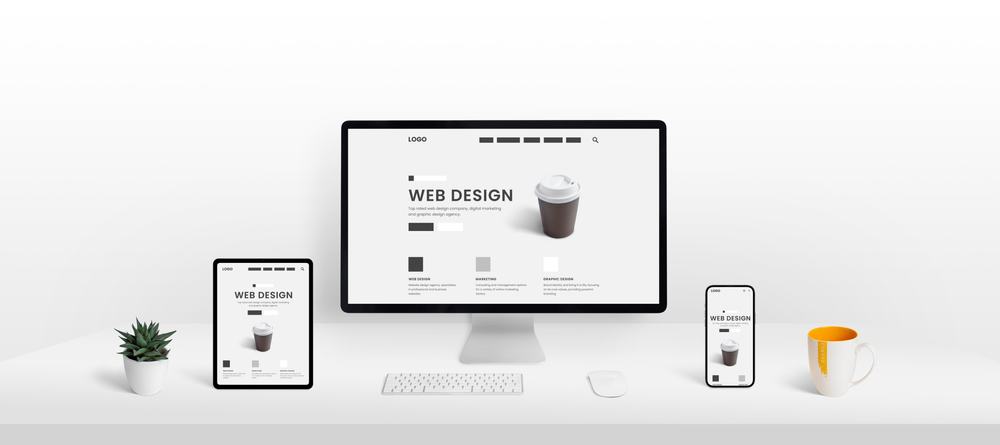
What Does Mobile Responsive Mean?
Mobile friendly and mobile responsive are often used interchangeably, but the two are not the same.
Briefly, mobile-friendly refers to a website that appears nearly the same on desktops and mobile devices. A mobile-friendly website will include specific touchscreen features like tap-to-call or touching addresses to open in your maps app.
Responsive design shares many characteristics of mobile-friendly but takes the user experience a step further.
They format themselves based on the user device. No matter your screen size, device type, or operating system, the website is designed to display perfectly.
They’re the most flexible website design and are becoming increasingly important for companies with a large mobile user base.
3 Reasons Your Site Should Be Responsive, Not Just Mobile Friendly
Responsive design is taking priority over mobile-friendly websites. If your website hasn’t joined the responsive revolution, consider these three reasons why you need to:
1. Responsive Websites Offer Better Functionality
Responsive websites were designed to increase functionality for mobile users at scale. That is, you no longer need a dedicated mobile website.
Users can take advantage of your full website, which didn’t use to be the case.
2. Content Is Better Accessed
A mobile responsive design cuts down on the clutter on your web pages. This makes it easier for visitors to find the content they came for.
Because content is formatted to fit the user’s screen, your audience won’t have to zoom in or out to get the full experience.
3. Responsive Sites Load Faster
Your website speed can affect your SEO. The faster your site loads, the better advantage you have of ranking higher.
Responsive websites tend to load faster than mobile-friendly sites.
Given that most consumers expect web pages to load in 2-3 seconds, increasing your website speed has more benefits than just SEO. You want to meet customer expectations to prevent them from bouncing.
Is Your Website Responsive?
Perhaps a better question is this: what does mobile responsive design mean for your business? Could a lack of responsiveness be responsible for killing sales or sending customers to your competitors?
Putting together all of the moving pieces of a responsive website is quite an undertaking. Not only do you need to consider the mechanics of your website, but you may also need to optimize your content for mobile.
Let LocalBizGuru perform a free site audit to discover where you can make improvements and create a better mobile user experience.