The internet has only grown in popularity since its inception, with no signs of slowing down. There is no doubt that it is the way of the present and of the future. Online shopping has become one of the fastest-growing industries. It is imperative to have a commanding online presence if your business is going to scale and grow. If your website isn’t already focused on mobile SEO, it should be. Did you know that a whopping 1.6 billion people use their mobile devices to make online purchases per year? If you aren’t focused on mobile SEO, you are missing out on a large sector of your target audience. This is your guide to mobile SEO in a mobile world and why you need it.
What is Mobile SEO?
As you’ve probably guessed by now, mobile SEO stands for mobile search engine optimization. This is the process of optimizing your website’s content so that it ranks higher on search engine results pages based on mobile devices such as smartphones and tablets. In other words, you are designing your website to ensure mobile device users have a great experience and search engines recognize your website as relevant for certain keywords.
Why is Mobile SEO Important?
Excluding work, think about how much you use your mobile device when searching for information, browsing the internet, or online shopping. Chances are, you use your smartphone or tablet more often when engaging in these activities than you do your desktop. You aren’t alone; the use of mobile devices is on the rise with no signs of slowing down. In fact, over 50% of all searches come from mobile devices.
- More than likely, most of your target audience is mobile device users
- Certain search engines, such as Google have switched to a mobile-first approach, where they rank websites according to mobile SEO instead of desktop SEO
- An increasing number of consumers use their mobile devices to research products before they purchase them either online or in the store
- Users who are unable to easily navigate your website on a mobile device will exit without taking action and may never return
Characteristics of a Mobile-Friendly Website
There are certain distinct qualities that every mobile-friendly website possesses. Users instinctively know what these qualities are, even if they are unable to put a name to each one.
Website Loads Correctly
A mobile-friendly site loads correctly on a smartphone, tablet, or another mobile device. This means there aren’t any errors on the page. A page that does not load correctly means visitors are unable to fully utilize your site, or worse, access your site.
Quick Load Time
Mobile users are on the go. They do not have time to wait on pages to load. A quick load time means your website is mobile-friendly. If your website is slow to load, users will exit out and probably never return.
Easy-to-Read Content
How many times have you visited a website that you had to scroll from side-to-side and pinch and zoom to see all of the material? That is not a mobile-friendly website and makes for a frustrating experience for users. All content on each page needs to fit on the screen of the mobile device at one time and be easy to read.
Easy-to-Navigate Site
A mobile-friendly website is easy to navigate. Links are easy to click on and forms are simple to fill out. This is an extremely important component of mobile-friendly websites. A website that is difficult to navigate will deter visitors from taking action on your site, such as making a purchase.
Behind the Scenes
Behind the scenes, you must make sure your mobile SEO is set so that search engines can easily understand your site and that it is mobile-friendly.
How to Make Sure Your Site is Optimized for Mobile SEO
Optimizing your site for mobile SEO is more than just making sure the behind-the-scenes settings are just right. You also have to take into account the user experience. The combination of the two will ensure that your site is optimized for mobile SEO. Here are some things to think about.
How Responsive is Your Design?
One of the first steps to making sure your site is geared for mobile SEO is to make sure that your site is responsive. Mobile devices come in a wide range of sizes, which means you cannot just optimize for one screen size. A responsive design means that your site will automatically adjust to any size screen for a satisfying mobile user experience.
Make Sure Navigation is a Breeze
There is nothing more frustrating than trying to click on a link that is too small or placed too close to another link, making it impossible to click on the right one. Make sure links and buttons are large enough for users to easily click on and that there is enough space around each to avoid accidental clicking.
Create a Consistent Experience
Users need to be able to have a consistent experience between devices. For instance, let’s say a user puts two products in their cart from one device and later wishes to continue with the purchase from another device. The user expects those same two items to still be in their cart, even though they are on a different device. This is just one example of creating a seamless experience for mobile device users.
Shorten meta titles and descriptions
For best results, shorten meta titles and descriptions to be less than what is allotted for desktop optimization. Keep it short, sweet, and to the point while including the most important keyword(s).
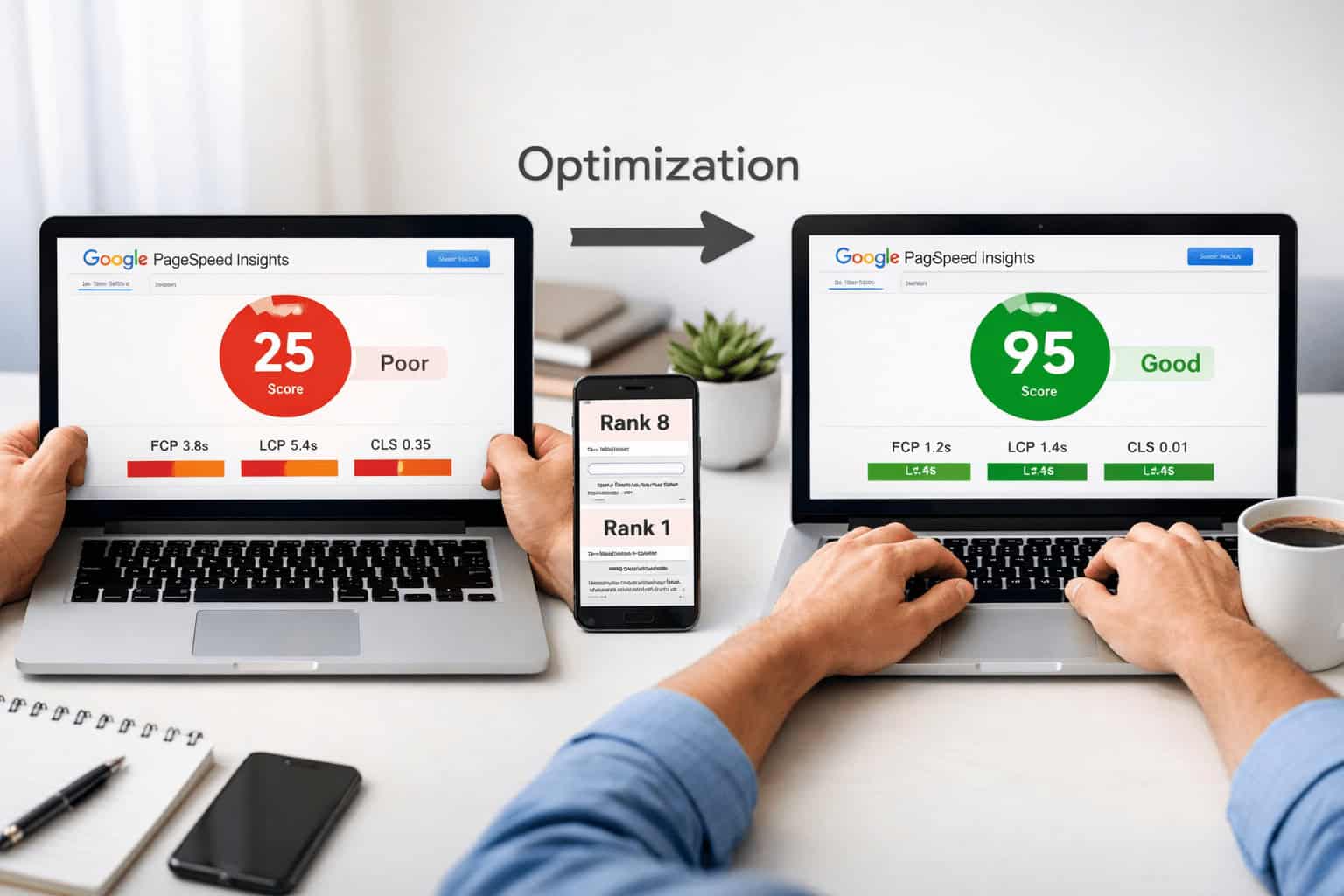
Improve Page Load Time
Many users will click the back button and try a different link from the SERPs if your site doesn’t load within a few seconds. The pages on your website must load quickly. Otherwise, not only do you lose a potential consumer, but search engines recognize that users are clicking on a different link and may determine that your site is irrelevant to that particular phrase. This is detrimental to your website ranking on search engines.
The use of Accelerated Mobile Pages (AMP) is an open-source project that makes mobile pages load instantaneously. It is important to remember that page loading time is a big factor in search engine ranking. While implementing design restrictions play a large part in increasing the speed at which a page loads, the actual advantage is that the page begins loading before a visitor even clicks on it. This means when the visitor does click on the page, it loads in an instant.
Make Sure Your Site is Secure
Not only are sites that are determined to be unsecured flagged, but most people will not visit a site that is deemed as an unsecured and therefore risky site. Make sure you are securing your site with HTTPS to ensure your site is recognized by search engines and users as being credible and trustworthy.
Voice Search is the Way of the Future
With advancements in technology, you can use voice search on your mobile device and in your home with devices such as Google Home and Amazon Alexa. Optimizing for voice search will help your website appear on SERPs.
Are You Ready to Get Your Website Found Online?
If you’re ready to get your website found online, LocalBizGuru is here to help. We understand the importance of a strong online presence and specialize in maximizing businesses’ online presence. When you’re ready to scale and grow your business, contact us to schedule a free consultation.